NOKIA DIGITAL TWIN
NOKIA DIGITAL TWIN
A digital twin for end-to-end network operations

Role
Designer
Team
2 designers, 5 developers
Timeline
12 weeks
Tools
Figma
PROBLEM
PROBLEM
Engineers need a way to manage, monitor, and test network changes without risking outages to their customers.
SOLUTION
SOLUTION
Digital twin: a virtual replica of networks, updated with real-time data to enable end-to-end network operations without risking live networks
A digital twin works by creating a lab package containing a virtual replica of the devices in a network. This way, engineers can build, test, and monitor networks on this virtual replica rather than the real one - you can think of digital twin like a sandbox for networks!
How did I add value?
As a UX design intern, I was the lead designer for all four modules of the digital twin!

🗺️
Network topology
Build and configure devices in networks

📋
Network node inventory
View inventory of devices in networks

⚙️
Network node configuration
Configure nodes in networks

🔎
NTA
Run and monitor tests on networks
Run and monitor tests on networks
⚠️
This case study could be a long one so I’ll be mostly focusing on the testing module, NTA. If you'd like the full case study, please contact me!
CHALLENGE
CHALLENGE
V1 of the digital twin was built by only developers.
The UI was not intuitive and didn't reflect the brand and design of Nokia products. There was also a lack of features that failed to meet users' needs. So, I was brought on as the lead designer to redesign the UI.
💡
How might we scale digital twin to support network engineers with intuitive, end-to-end network operations?
PROCESS
PROCESS
The project followed the double diamond design process. I focused on the later stages of the design processes, ideating solutions and then developing and delivering them under business and technical requirements.

Some highlights!
🎨
Design jams w/ PMs → I learned how to build stronger buy-in.
⚙️
UI redesign w/ the design system → I learned when to work within the limits of existing components, colours, fonts, and when to thoughtfully push their limits.
💻
Design handoffs w/ devs → I learned how to create clear, consistent documentation for my designs.
DESIGN DEEP DIVE #1
DESIGN DEEP DIVE #1
How might we scale digital twin?
The team wanted to scale the number of modules and lab packages, so I re-designed the modules, lab package, and lab package panel to support this.

Increasing the discoverability of modules
⚠️
In V1, modules were hidden in a dropdown, leading to poor visibility and discovery.


✅
In V2, I surfaced modules in a tab menu, increasing visibility and discovery, and reducing clicks needed to navigate between modules.


Increasing functionality of lab packages
⚠️
In V1, there were only 3 functions and their icons cluttered the lab package, reducing visibility of the lab name and status. Users also confused lab status as a function.


✅
In V2, I added 5 more functions and introduced a clearer hierarchy, surfacing primary functions as icons and secondary functions living in a "more" menu. Typography, colour, and icons set apart primary info, like status, and secondary info, like credits, resulting in a clearer lab-package while still increasing functionality.
Improving navigation of lab package panel
⚠️
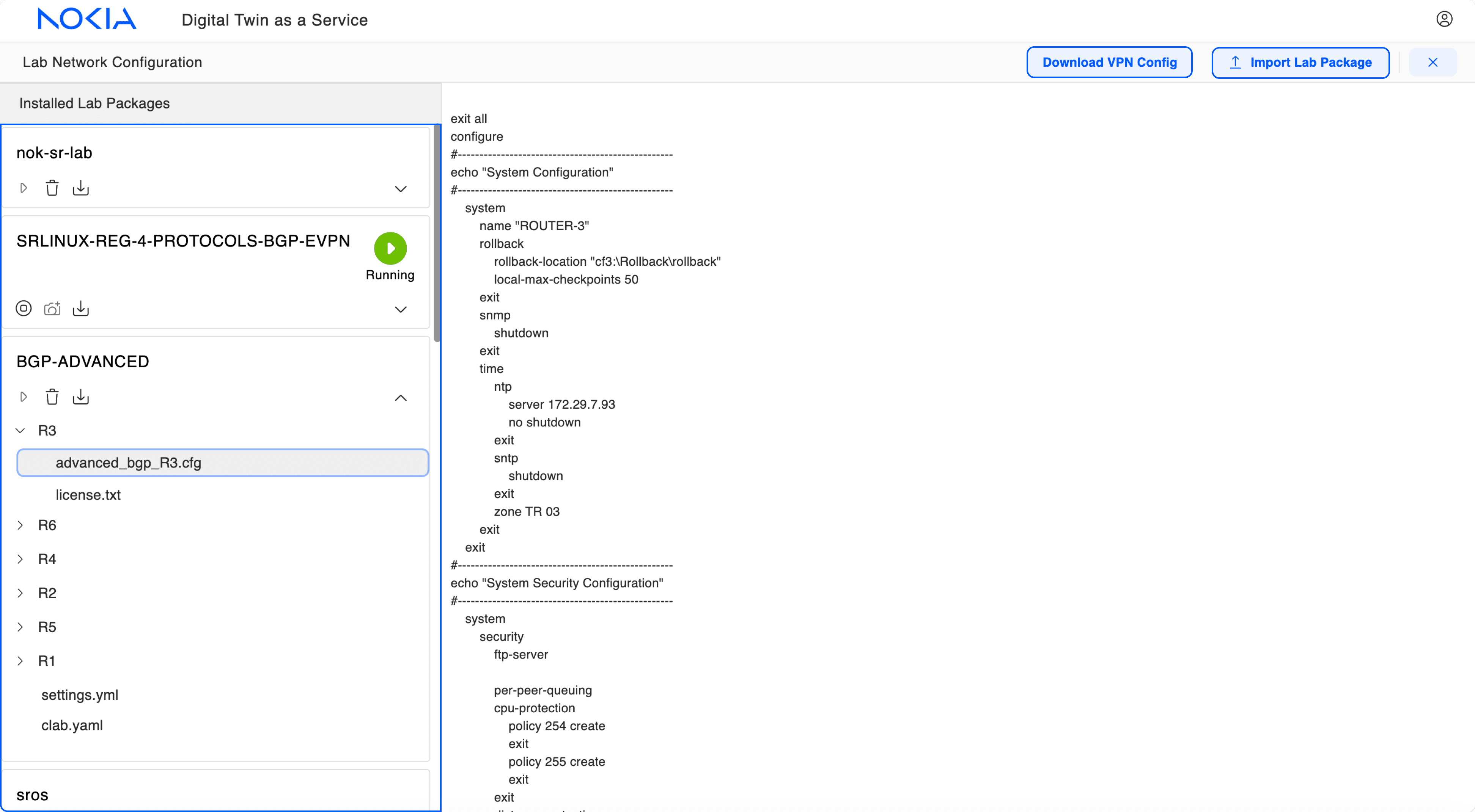
In V1, lab package related actions were on opposite ends of the module, and the lab package panel was one long, unstructured list, leading to poor navigation.

✅
In V2, I added all lab package related actions into the panel. I also ordered lab packages to create a clearer hierarchy, and added a search to improve discovery of packages.


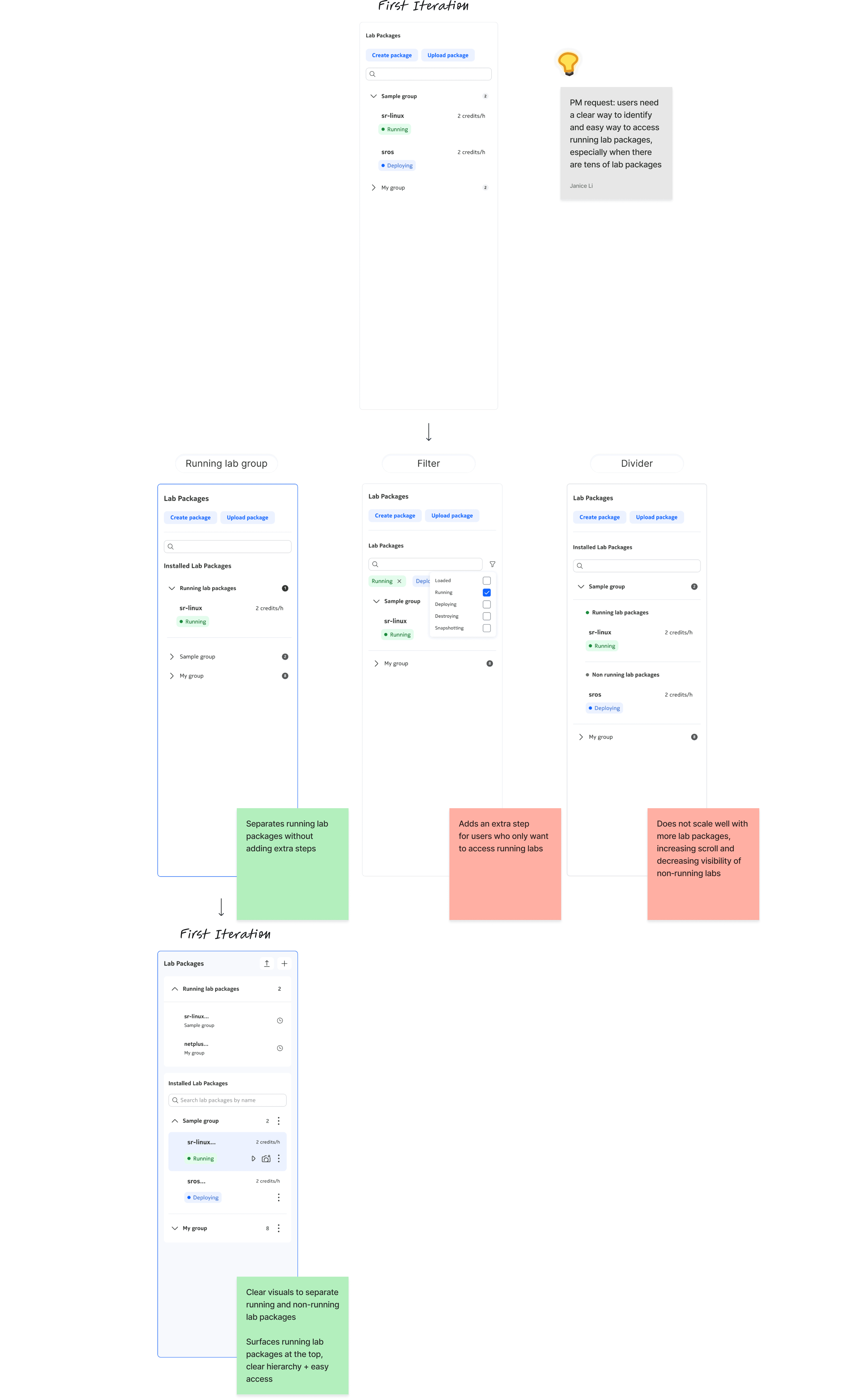
Here's some examples of explorations I took to get to the current lab package panel! I focused on organizing lab packages in groups and surfacing running lab packages.
DESIGN DEEP DIVE #2
DESIGN DEEP DIVE #2
How might we design intuitive network testing workflows?
🧠
The mental model
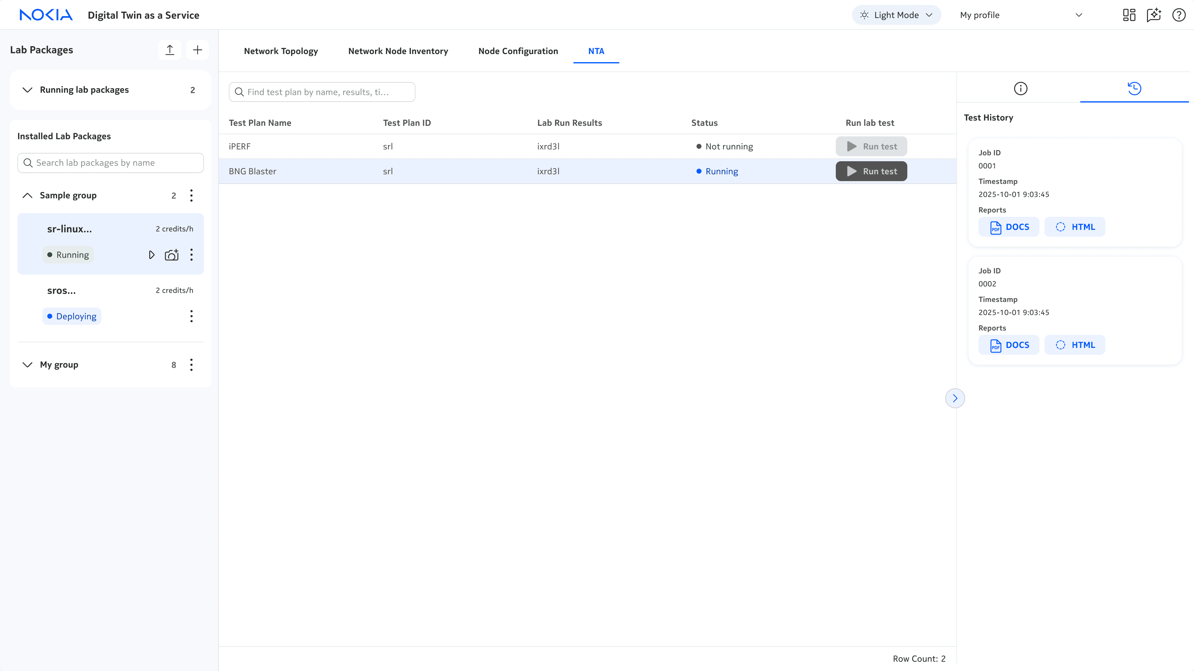
The NTA (Network Testing Automation) page was designed around the network testing mental model. This starts with selecting a lab package and test plan, then running and monitoring the test and results.

🏛️
The architecture
The NTA page follows this linear mental model through a three‑panel architecture, creating a clear and intuitive workflow for engineers.
1)
Lab package panel
Select lab package
2)
Test plan panel
Select + run test plans
2)
Test results panel
Monitor ongoing and previous test results


Although the current NTA looks simple, it took a lot of iterations to get here…
Iteration 1
✅
3rd party table → low dev efforts
❌
Limited data displayed in a table → poor scalability
❌
Test details and results displayed in the same table → unclear, difficult to understand results

Iteration 2
✅
Introduced results panel to display test results
❌
Run test was hidden in the panel → unclear where or what action to take
❌
Lots of unused space in the panel → what additional data could we add to support network engineers?

Iteration 3
✅
Re-organized data so that all the pre-run test data is in the table and all the post-run test data is in the panel → clear and intuitive workflow
✅
Worked with devs to surface more useful post-run test data in the panel (success!). We were able to break down test results into phases →richer context and results
REFLECTION
What did I learn?
⚙️
Owning the end-to-end design
As the lead designer, I learned to take full ownership of the end-to-end design, from advocating for users and design decisions, to delivering user-centred solutions that solve real technical challenges.
🚧
Communicating design ideation and explorations
I learned how to clearly organize and present my design explorations—both synchronously and asynchronously—by providing clear context, design rationale and recommendations. This helped me jam more and have buy-in with devs and PMs!
NOKIA DIGITAL TWIN
A digital twin for end-to-end network operations


Role
Designer
Team
2 designers, 5 developers
Timeline
12 weeks
Tools
Figma
PROBLEM
Engineers need a way to manage, monitor, and test network changes without risking outages to their customers.
SOLUTION
Digital twin: a virtual replica of networks, updated with real-time data to enable end-to-end network operations without risking live networks
A digital twin works by creating a lab package containing a virtual replica of the devices in a network. This way, engineers can build, manage, monitor, and test networks on this virtual replica rather than the real one.
How did I add value?
As a UX design intern, I was the lead designer for all four modules of digital twin, and now am designing new modules for release #2 (stay tuned!).


🗺️
Network topology
Build and configure devices in networks


📋
Network node inventory
View inventory of devices in networks


⚙️
Network node configuration
Configure nodes in networks


🔎
NTA
Run and monitor tests on networks
⚠️
This case study could be a long one so I’ll be mostly focusing on the testing module, NTA. If you'd like the full case study, please contact me!
CONTEXT
V1 of digital twin was built by only developers.
The UI was not intuitive and didn't reflect the brand and design of Nokia products. There was also a lack of features that failed to meet users' needs.
CHALLENGE
💡
How can we scale digital twin to support network engineers with intuitive, end-to-end network operations?
PROCESS
The project followed the double diamond design process focused on the later stages of the design processes, exploring solutions and then developing and delivering them in alignment with business and technical requirements.


Some highlights!
🎨
Design jams w/ PMs → I learned how to build stronger buy-in
⚙️
UI redesign w/ design system → I learned when to work within the limits of existing components, colours, fonts, and when to thoughtfully push their limits.
💻
Design handoffs w/ devs → I learned how to create clear, consistent documentation for my designs
DESIGN DEEP DIVE #1
How can we support scaling digital twin?
I re-designed 2 core components to support scaling digital twin while working within the … to reduce dev efforts.


Modules
Modules are the … and enable engineers to build, manage, test, and monitor their virtual networks. The team wanted to scale digital twin from 2 to 4 modules in V2.
⚠️
Poor visibility and discoverability
In V1, modules were hidden in a dropdown menu, leading to poor visibility and discoverability.


✅
In V2, I introduced a tab menu to improve visibility and discoverability, and reduce number of clicks required to navigate between modules.


Lab package panel
The lab package panel is an inventory of all the lab packages. The team wanted to scale the functionality of lab packages and the lab package panel.
⚠️
Limited functionality + poor navigation
In V1, lab package related actions were on opposite ends of the module, and lab package panel was one long, unstructured list, leading to poor usability.


✅
In V2, I organized all lab package related actions into the panel. I also grouped lab packages to create clearer hierarchy, and added a search to improve discovery of lab packages.


I added more functionality to lab packages at both an individual and group level, creating a clearer, more intuitive workflow. I also used typography, colour, and icons to create clearer hierarchy between primary and secondary lab package actions and info.
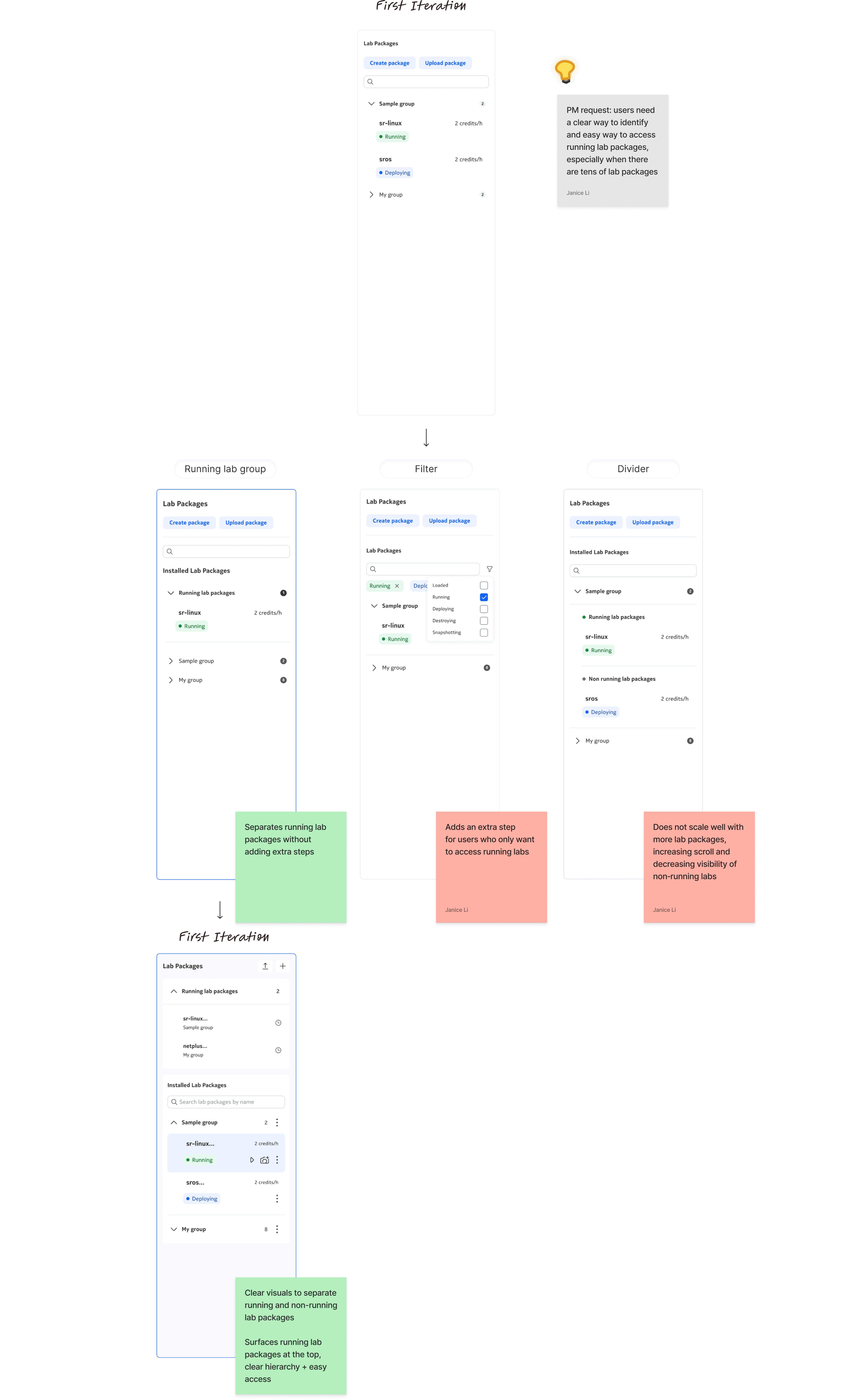
Here's some examples of explorations I took to get to the current lab package panel!

DESIGN DEEP DIVE #2
How might we design intuitive network testing workflows?
🧠
The mental model
The NTA (Network Testing Automation) page was designed around the network testing mental model. This starts with selecting a lab package and test plan, then running and monitoring the test and results.

🏛️
The architecture
The NTA page follows this linear mental model through a three‑panel architecture, creating a clear and intuitive workflow for engineers.
1)
Lab package panel
Select lab package
2)
Test plan panel
Select + run test plans
2)
Test results panel
Monitor ongoing and previous test results


Although the current version looks simple, it took a lot of iterations to get here…
Iteration 1
✅
Low dev efforts
❌
Limited data displayed in a table → poor scalability
❌
Test details and results data displayed in the same table → unclear, difficult to understand


Iteration 2
✅
Introduced results panel to display test results data
❌
Run test was hidden in the panel →unclear where or what action to take
❌
Lots of unused space in the panel →what additional data could we add to support network engineers?


Iteration 3
✅
Re-organized data so that all the pre-run test data is in the table and all the post-run test data is in the panel → clear and intuitive workflow.
✅
Worked with devs to surface more useful post-run test data in the panel (success!). We were able to break down the test results into phases → richer context and results
REFLECTION
What did I learn?
⚙️
Owning the end-to-end design
As the lead designer, I learned to take full ownership of the end-to-end design, from advocating for users and design decisions, to delivering user-centred solutions that solve real technical challenges.
🚧
Communicating design ideation and explorations
I learned how to clearly organize and present my design explorations—both synchronously and asynchronously—by providing clear context, design rationale and recommendations. This helped me jam more and have buy-in with devs and PMs!


