Role
Designer, Researcher
Team
2 designers
Timeline
4 weeks
Tools
Figma
GO train uses a pay-by-distance fare system — the more riders ride, the more they pay. This requires riders to tap off their PRESTO card at the end of their trip but if they forget, they are charged the full trip (up to $20 more than their actual trip)
Never miss a tap off with real-time reminders and tap offs in the PRESTO app
As a UX design intern at PRESTO, I designed and pitched a mobile app proof of concept in four weeks. Riders can track their trip in real time, receive reminders to tap off, and tap off their PRESTO through the app. This helps riders not only recognize but recover missed tap offs .

SKIP TO THE FINAL SOLUTION
While we had the numbers behind the missed tap offs, we didn't have the why
200,000+
missed tap offs a month
2/3
of missed tap-offs are never reported to the call centre and unresolved
Only 30%
of riders report there's clear instructions of when to tap on and off
Overcoming user research constraints
As a UX designer, I knew I needed to understand the "why" through our users but due to budget constraints, I couldn't conduct user interviews. That's when I turned to platforms like Reddit, where riders shared their frustrations for missed tap offs.

50+ posts later and what did we discover?
😵💫
Riders are overwhelmed
Between planning their trip, catching their train, and everything in between—riders forget to tap off
🔇
Reminders to tap off are easy to miss
Riders miss audio announcements as trains are too loud, and signs are hard to see in crowded stations
⏰
Riders realize too late
By the time riders realize they forgot to tap off, they are already too far from the station to tap off
📞
Riders avoid the call centre
When riders forget to tap off, they rather incur the extra cost than contact customer service
All to say, riders didn't realize they needed to tap off in the moment, and when they tried to resolve their missed tap offs, they experienced many pain points
💡
How are others solving the problem?
PRESTO is unique in requiring riders to tap on and off, but I wanted to see how other transit systems were empowering their riders.


Then, it was finally time to dive into design! I started with the key features first, then worked my way to the supporting features.


How might we help riders feel less overwhelmed?
While we can't change cancellations or delays, how they're communicated can make all the difference. Through research, I discovered that riders often coordinate trips with friends and family. To reduce the stress from constant check-ins, I designed a feature that lets riders share their trip in real-time.

A more intuitive way to plan trips

Bringing all the designs together into the final flow
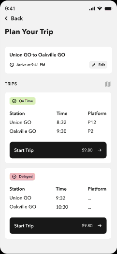
To start, riders plan their trip based on their departure and arrival station and time.

Next, riders select the trip they want to start and can toggle between map or non-map view, depending on their preference.

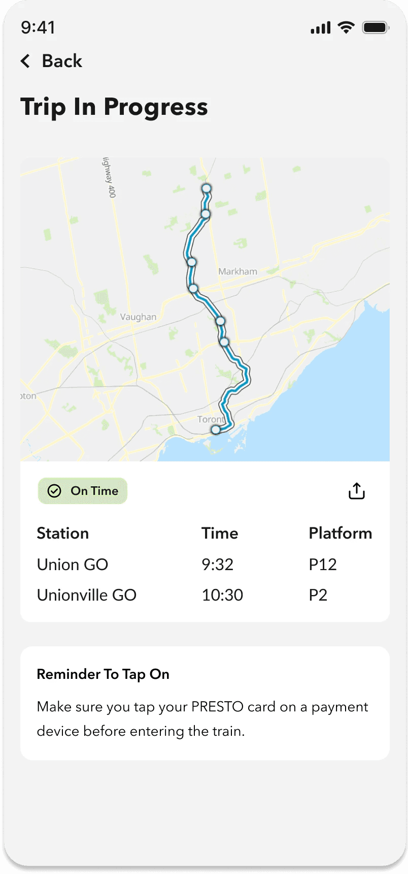
Next, riders can start tracking their trip, both in the app and on their lock screen. They can also share their trip with anyone they would like to.

Riders can view their trip progress on their lock screen, viewing details like estimate time of arrival and transfer window.

Lastly, if riders forget to tap off, the app will detect a missed tap off and prompt them to tap off in the app.
