Splend
A mobile app to mindfully track your daily spending.
Overview
Timeline
6 weeks
Role
Designer, Researcher
Tools
Figma
TL;DR
The Problem
Many people struggle to manage their spending and often use tools to help. Most of these tools are automated - just link your bank account, and the tool tracks everything for you. The downside? It's easy to forget and lose track of your spending.
The Solution
Splend is a mobile app that reimagines expense tracking by encouraging mindful engagement. Using speech-to-text technology, it offers a simple, seamless experience users can integrate into daily life, empowering them to actively track and take control of their spending.
This was my first UX design project, where I led the process from user research to ideation and iteration. I'm excited to share my journey and key takeaways!
Overview of my design process
VIEW FINAL SOLUTION
⋆ ˚。・*⋆
PART 1
Discover
Research
I conducted research to understand the current state of personal finance and users' pain points when it came to their personal finances.
📍 The Current State
To understand the state of personal finance, I looked into several financial reports from banks and market research firms.
Majority of Canadians say rising high costs are affecting their ability to reach financial goals — but many believe being proactive and planning could improve their finances.
Their top financial goals? 1) start saving and 2) stop overspending.
The challenge is that Canadians aren't reviewing their spending regularly. Most only do so monthly, some just yearly, — and others not at all.
This is all to say - saving and spending are major concerns for Canadians, but not enough is being done to take control of their finances.
⋆ ˚。・*⋆
🧑 Empathizing with Users
I conducted one-on-one interviews with 5 adults who manage their own finances to uncover the problem. Many of the findings from the reports were validated through user interviews.
Example of a user persona
⋆ ˚。・*⋆
PART 2
Define
From Feedback to Insight
With all the feedback from users collected from the interviews, I synthesized the data by grouping sticky notes to identify patterns and related themes.
Grouping sticky notes and identifying themes
So, what did we discover?
After taking our research and synthesizing the results, we were able to define our solution space and focus on some main insights to guide our iterations.
💳
Money is spent on the go
Users typically spend money while out and about — after work, on weekends with friends, and so on— but budgeting and expense tracking often happen later, at home. This gap presents an opportunity to bring planning and spending closer together.
🤷♀️
Money spent is money forgotten
Some users have no idea how much money they’ve spent in the past week or month, others have some, but they’re uncertain what and where they’ve spent money. Some don’t track expenses at all, as it takes time and effort, others use automated tools to track, but often forget about it.
📈
Getting started is the hard
Users are intimidated by the learning curve of finance tools and often don't know where to start when it comes to their finances. Many also shared that while they got started, they stopped within months, stating that it was hard to keep up.
⋆ ˚。・*⋆
💡 The Opportunity
How might we design user-friendly financial tool that turns routine spending into mindful spending — helping users feel more connected to their everyday spending
⋆ ˚。・*⋆
How are others solving the problem?
I conducted a competitive analysis to understand how others have tackled expense tracking. Apps like You Need a Budget (YNAB) and EveryDollar use their own systems, but they lack intentional habit-building features. To explore this further, I turned to successful learning and wellness apps, like Duolingo and Headspace, designed to drive daily engagement.
Analyzing pros and cons of competitors
So, what did we discover?
💰 Finance Apps
Most lacked intentional habit-building features
Onboarding was often difficult—either due to a steep learning curve or requiring users to use a combination of features
Users tended to use the web more than the mobile version of the app, stating there were more features available on the web
🗓️ Habit-Building Apps
Use positive reinforcement — like rewards and streaks — to encourage engagement
Offer personalization and user control, from flexible onboarding to daily reminders
⋆ ˚。・*⋆
PART 3
Ideate
Devising the plan (Ideation)
I took key pain points and came up with 2-5 solutions for them each.
Ideating as many ideas as possible
Prioritization Matrix
Prioritizing ideas and potential features
🎯 Top Features
1. A step by step onboarding flow
2. A way to help users become more aware of their daily expenses and budget
3. A way to reward users for logging in their expenses regularly
⋆ ˚。・*⋆
PART 4
Design
When designing, I kept the top features in mind. I broke down the opportunity sentence into 3 parts to better tackle them.
How might we design a user-friendly tool?
Most finance tools have a steep learning curve, making it harder for users to get started on their finances. I wanted to design a simpler solution, but after testing with 3 users, my first design was far from simple. It was overwhelming and unclear.
🔄 Iterative Design
Reducing Cognitive Load
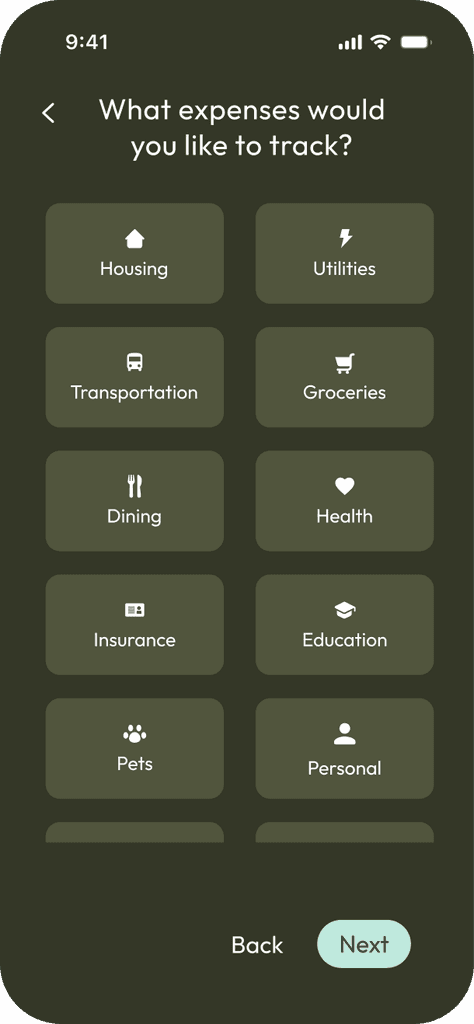
In the initial design, users had to manually set up all the expense tracking. I thought that this provided users a lot of customization, but after testing with users, I realized that this added a lot of unnecessary cognitive load on users. To simplify the experience, I added predefined categories with clear definitions, examples, and visuals. This allowed users to choose rather than define the categories themselves. This made the setup process a lot simpler and more intuitive for users.
Before
❌
Not a lot of guidance, users unsure where to start
❌
Too many form fields, overwhelming to users
After
✅
Breaks down onboarding in several steps
✅
Provides pre-defined categories and definitions, allowing users to recognize rather than recall (Nielson Norman usability heuristic #6)
Adding a review step with visual feedback
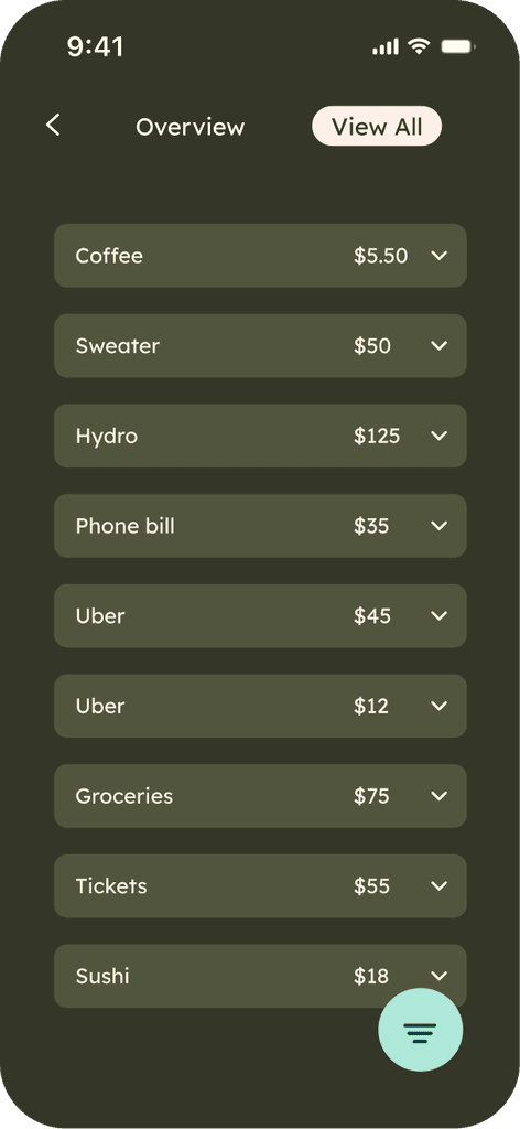
To reduce errors, I also added a review page with a bar graph. This allows users to visually view their budget across different categories and timeframes — weekly, monthly, and yearly.
✅
Provides a clear, visual summary of users inputs to better help users recognize and recover from errors (Nielson Norman usability heuristic #9)
⋆ ˚。・*⋆
Many tools help users track their spending, but most are automated. I asked myself, "What if users manually tracked their spending?" If users truly want to understand where their money is going, wouldn't it be best to track it themselves? That's when I got creative with ideas!
⚖️ Design Decisions
I took inspiration from input features in mobile devices, from the camera to the microphone. I came up with 3 ideas and then tested them with users.
Final decisions? Voice
Splend uses speech-to-text technology, allowing users to track expenses with their voice. Voice inputs process users' actions and thoughts, helping them become more mindful of their expenses. Voice inputs also allow users to track expenses hands-free, taking away the all too common challenges and inconveniences that come with typing on small screens.
Accessibility
One of my concerns with speech-to-text technology was accessibility. To address this, I researched design systems and W3C's WCAG and implemented 2 best practices I learned. In the future, I would love to design an alternative to speech inputs.
Visual Cues
I added icons to prompt users to take action, and labeled buttons for accessibility.
⋆ ˚。・*⋆
PART 5
Final Solution
Meet Splend
A mobile app that uses speech-to-text technology to help users mindfully track their spending.


