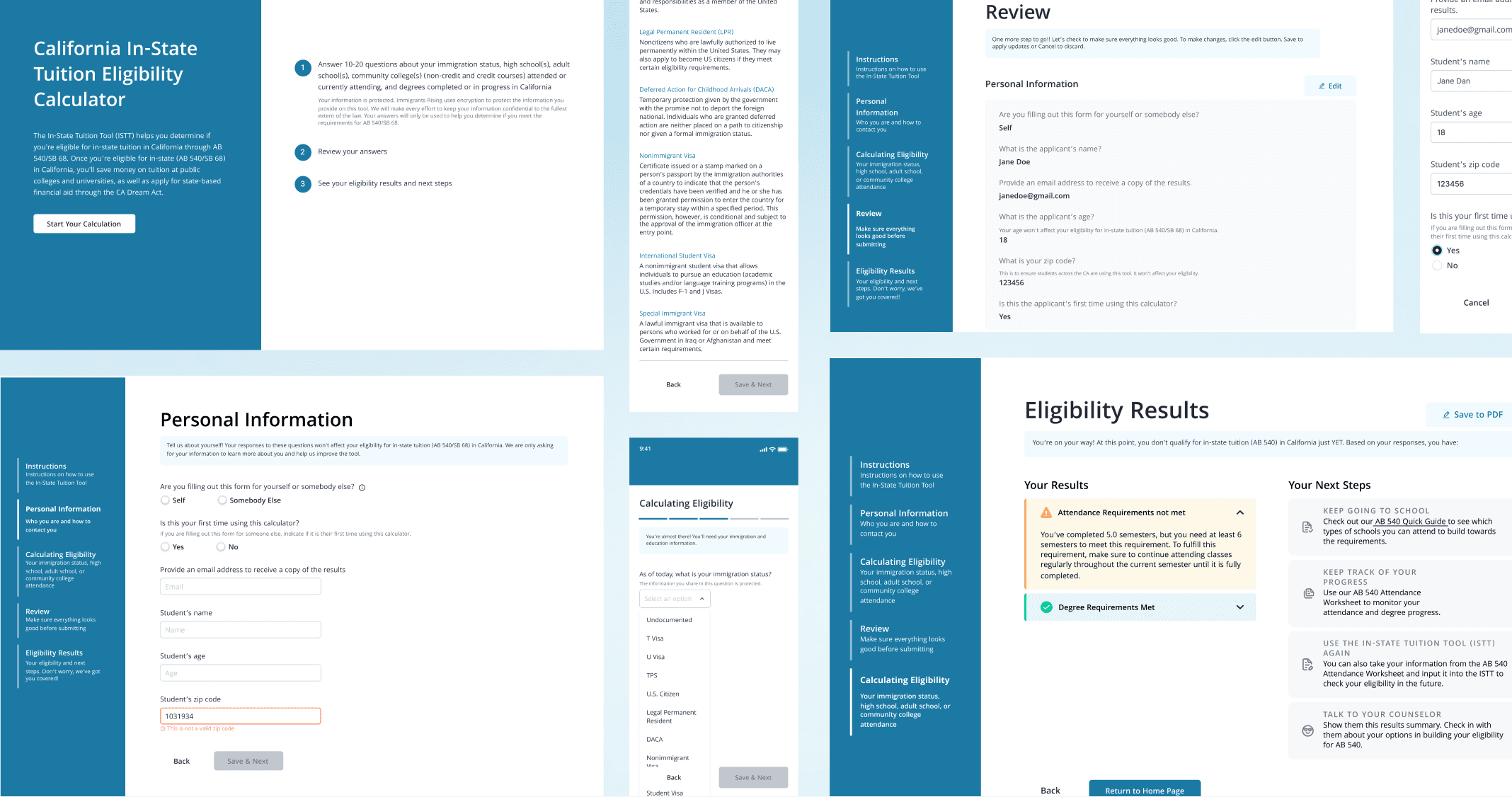
Simplifying the journey to affordable education for ~20,000 students
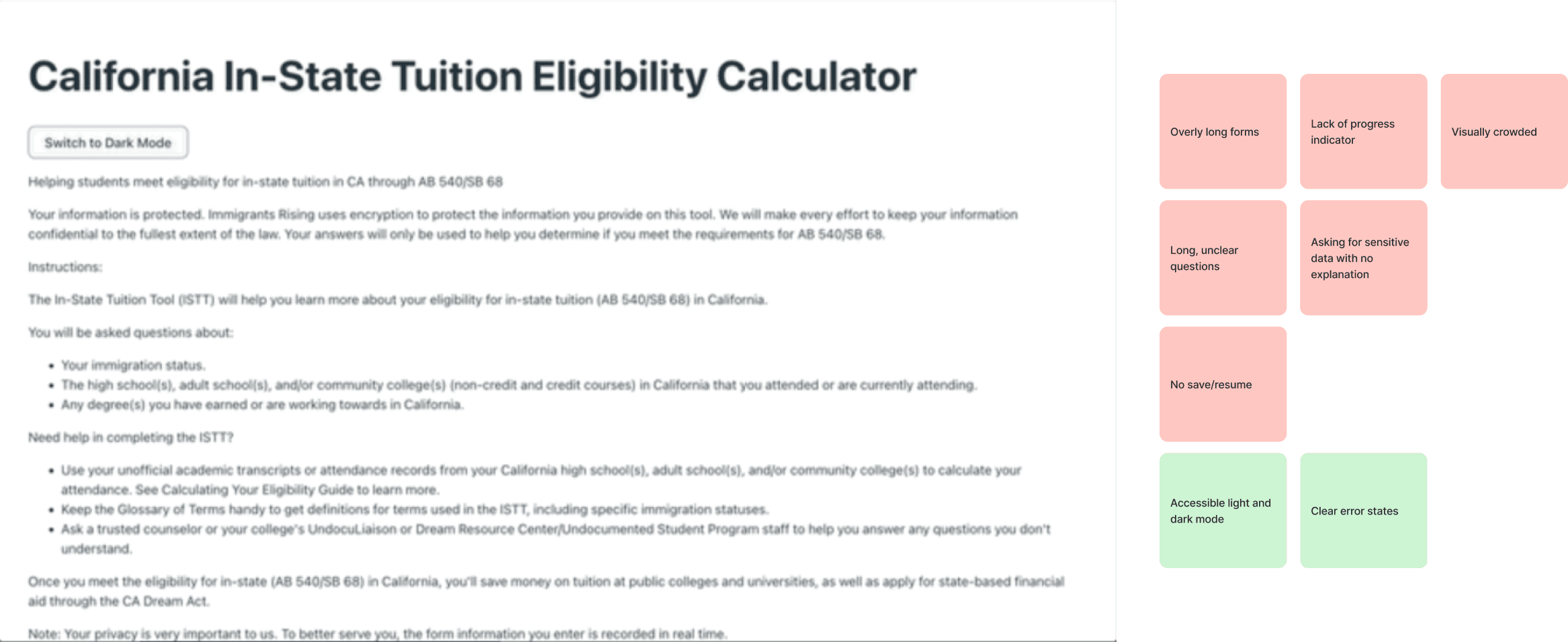
The current ISTT was a long, confusing form with no actionable results for users
Since we were redesigning the form, we started by trying out the form ourselves to see what could be improved.
What are users saying?
But we wanted to know what real users were saying so we recruited 5 students who previously used the ISTT. This allowed us to validate our own observations and uncover new insights about user's experiences!
What's going to happen if I don't qualify? Is there something I can do to still qualify?
If there were a tool to help me plan towards qualifying for in-state tuition— not just calculate — I'd use it.
I'd have to go to a guidance counsellor since I'm not familiar with all the different definitions and rules.
5 users later and what did we discover?
🎯
Actionable results = valuable results
The results from the current form weren't actionable. As a result, few users found the form to be actually valuable, leading to low rates of return.
📉
High complexity and drop offs
Some students found the form complicated and confusing, causing high drop off rates.
🚫
Lack of transparency and trust
Students were hesitant to answer some personal questions about their immigration status without understanding why the information was required.
💡
How might we increase clarity and transparency of the ISTT to help students accurately calculate their eligibility and determine actionable next steps to qualify for in-state tuition?
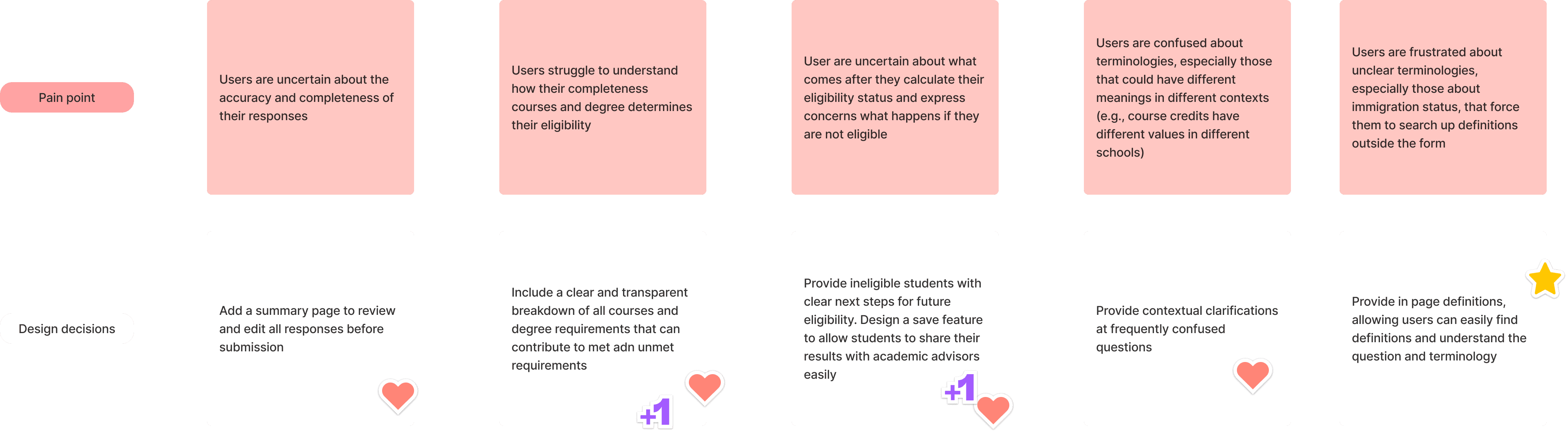
I led the transformation of user feedback into insights to drive our designs decisions
I started with a 5 step synthesis to turn feedback into actionable design recommendations. Check out the evolution of our feedback!

In addition the synthesis, I created a user journey map to visualize the form flow experience. This made it easier to understand user pain points and the underlying reasons within the journey.

From our synthesis and user journey map, we were able to define a set of design decisions to drive our designs.
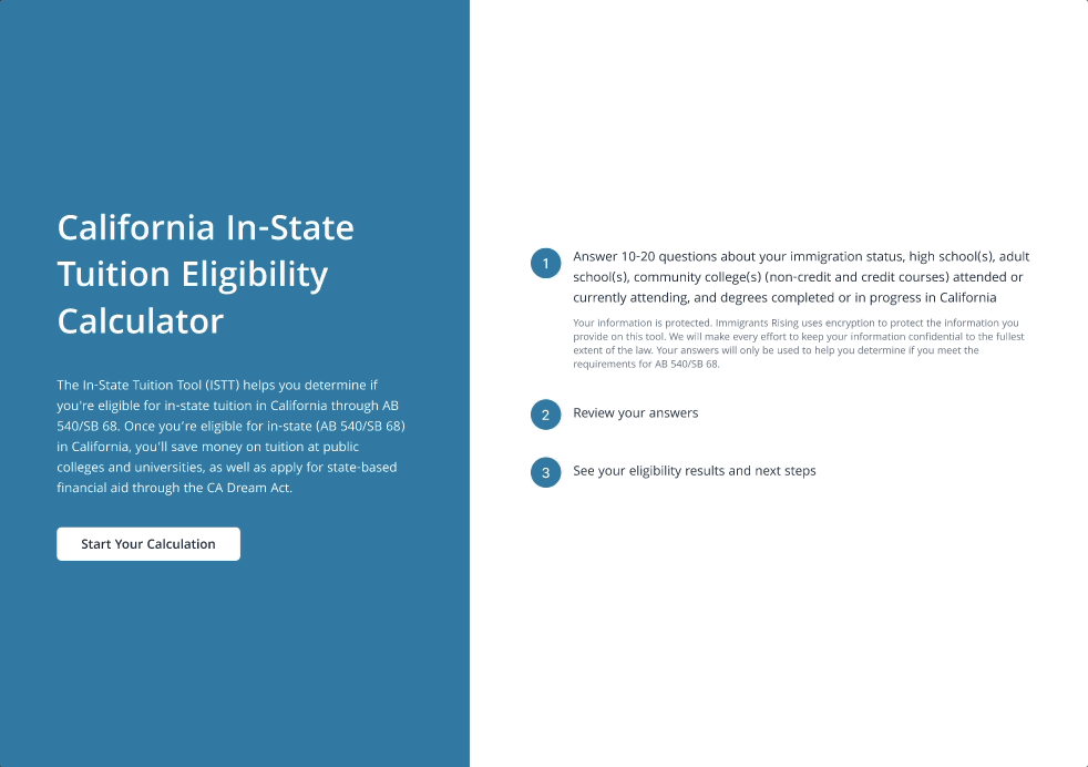
Before diving deep into the design, we revisited the existing user flow to identify gaps and introduce two new features.
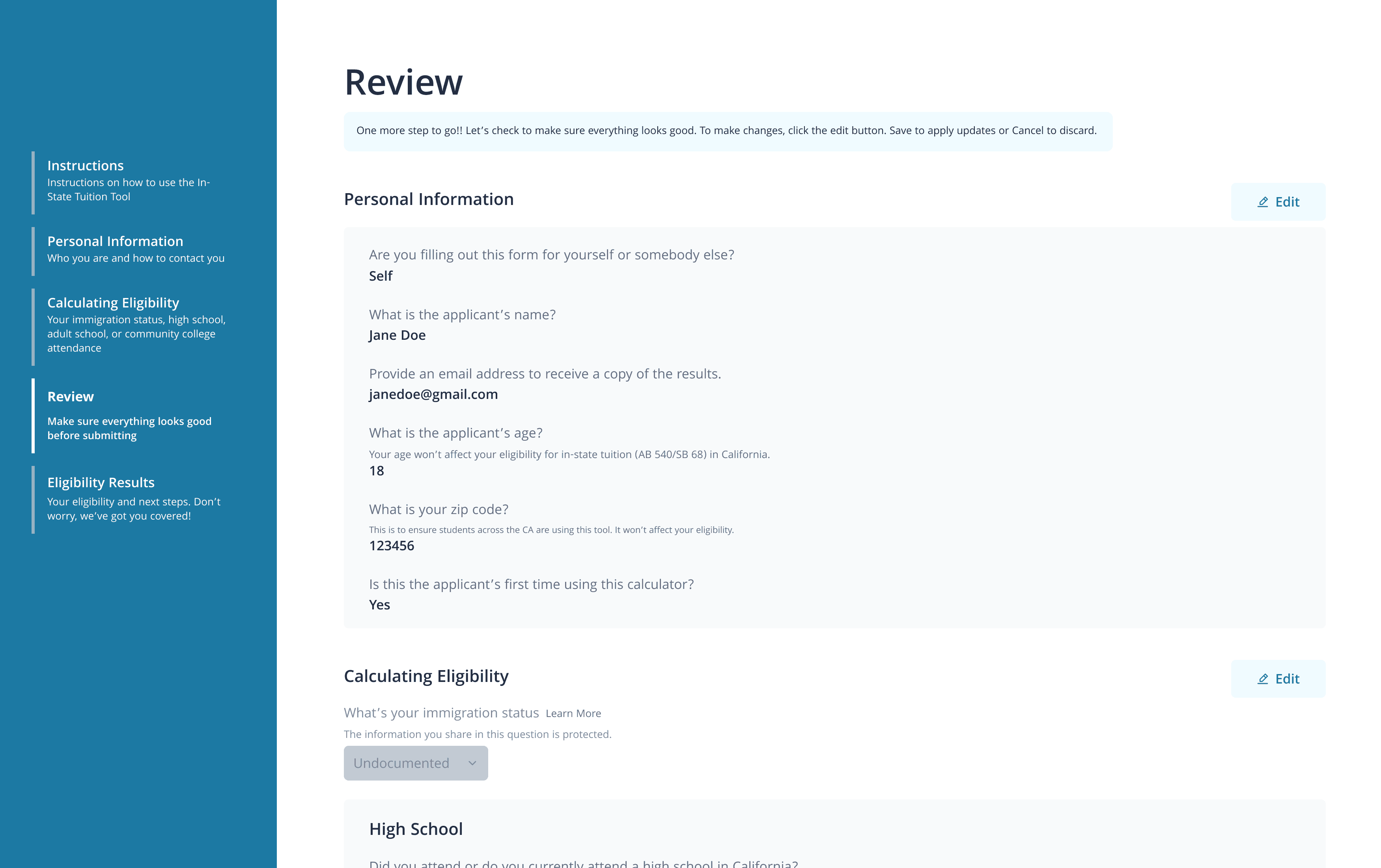
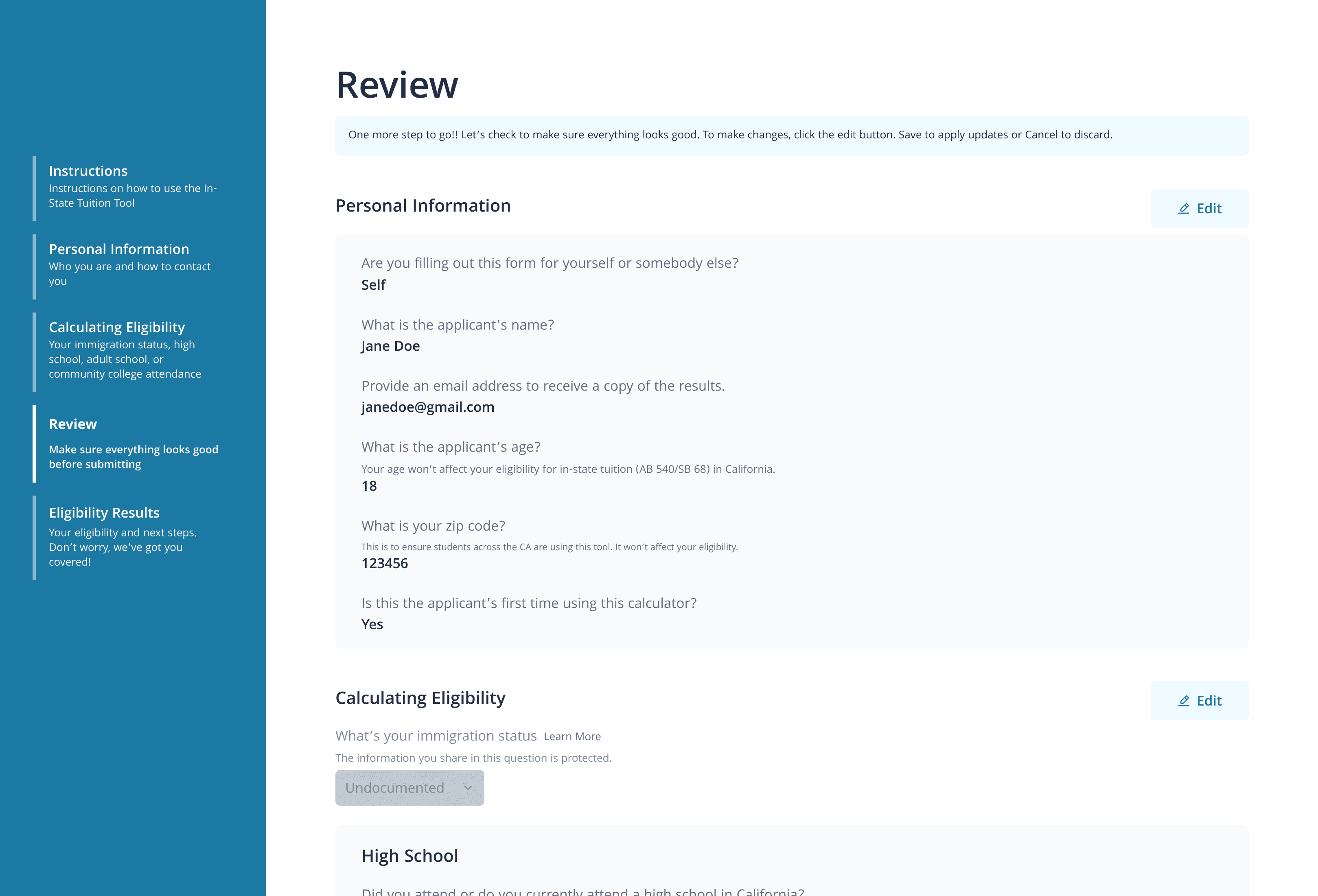
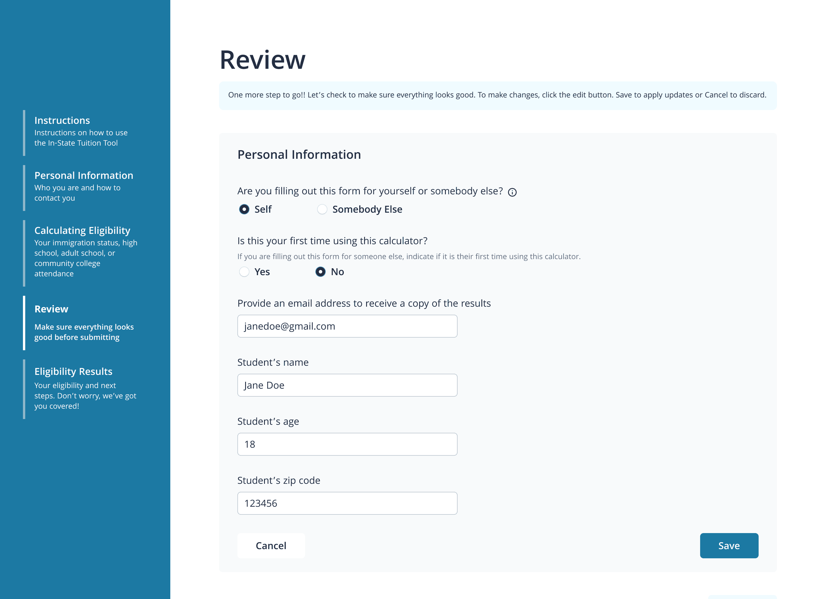
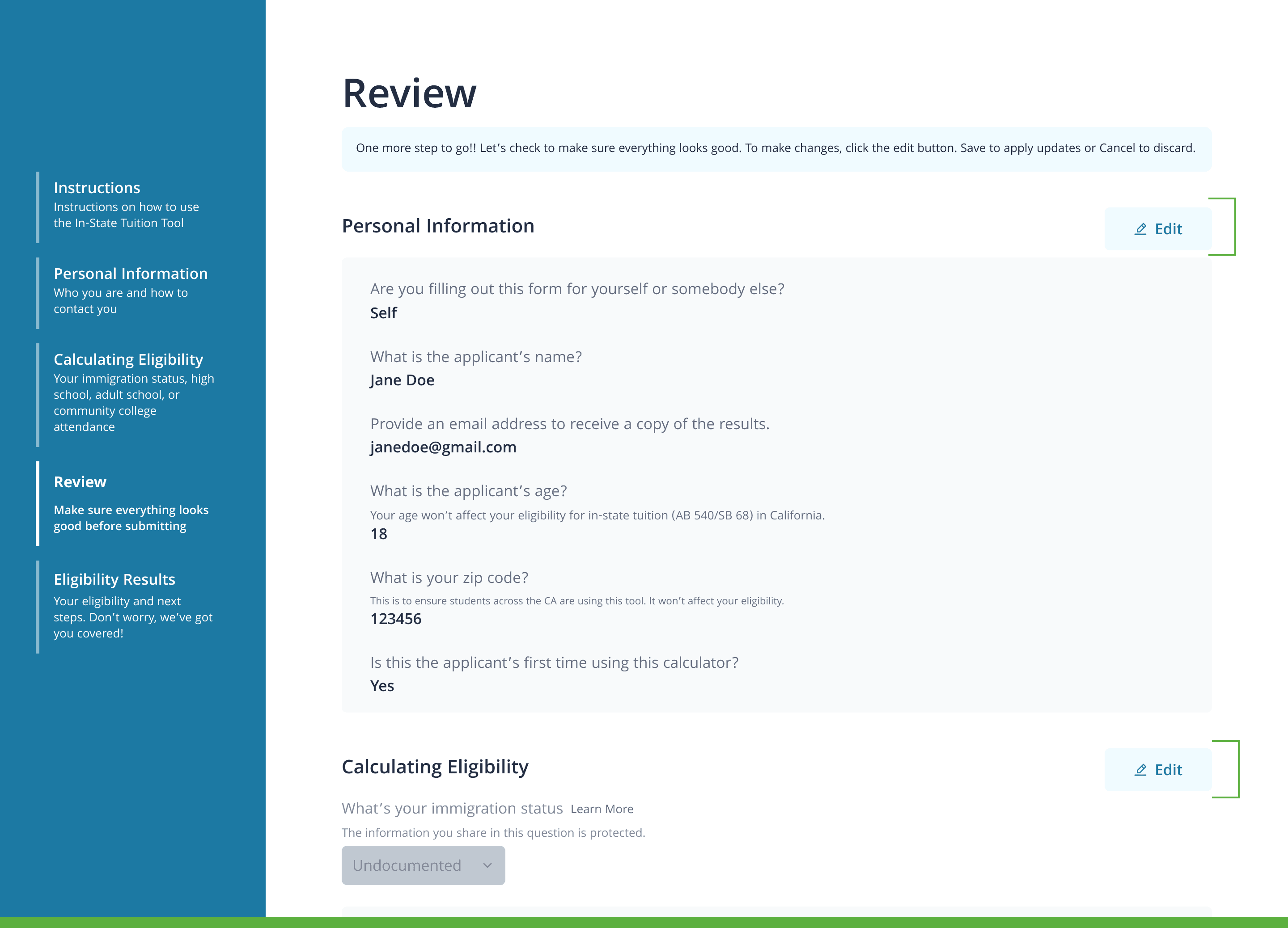
Review + Edit
To reduce user errors, we added a review page, enabling users to review and edit their information on the same page before submitting
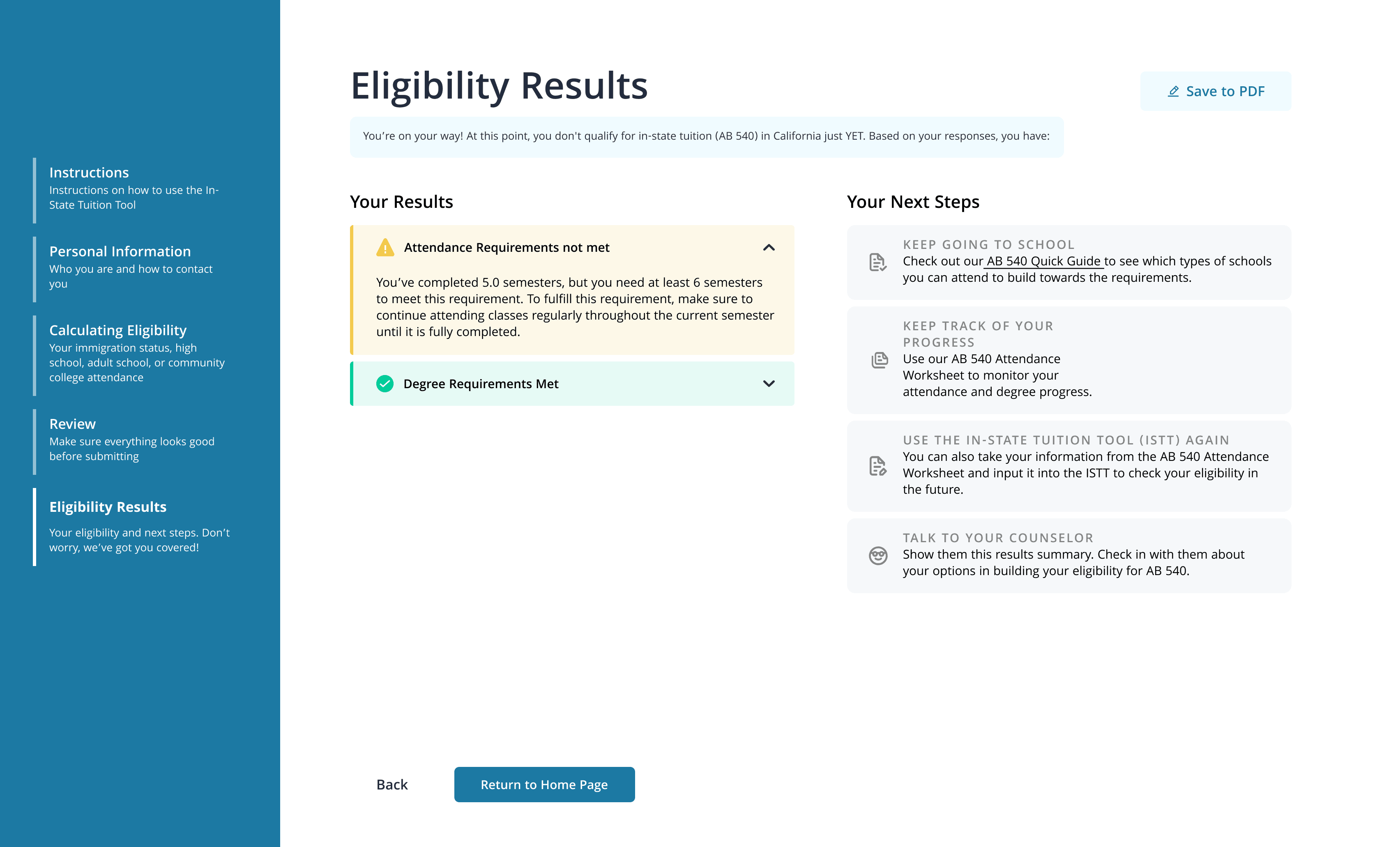
Results + Next Steps
To provide actionable results, we added a results page with a clear explanation of users' eligibility results and next steps to qualify

After lots of research, the best form design came down to 2 design decisions
⚖️ Horizontal vs vertical stepper
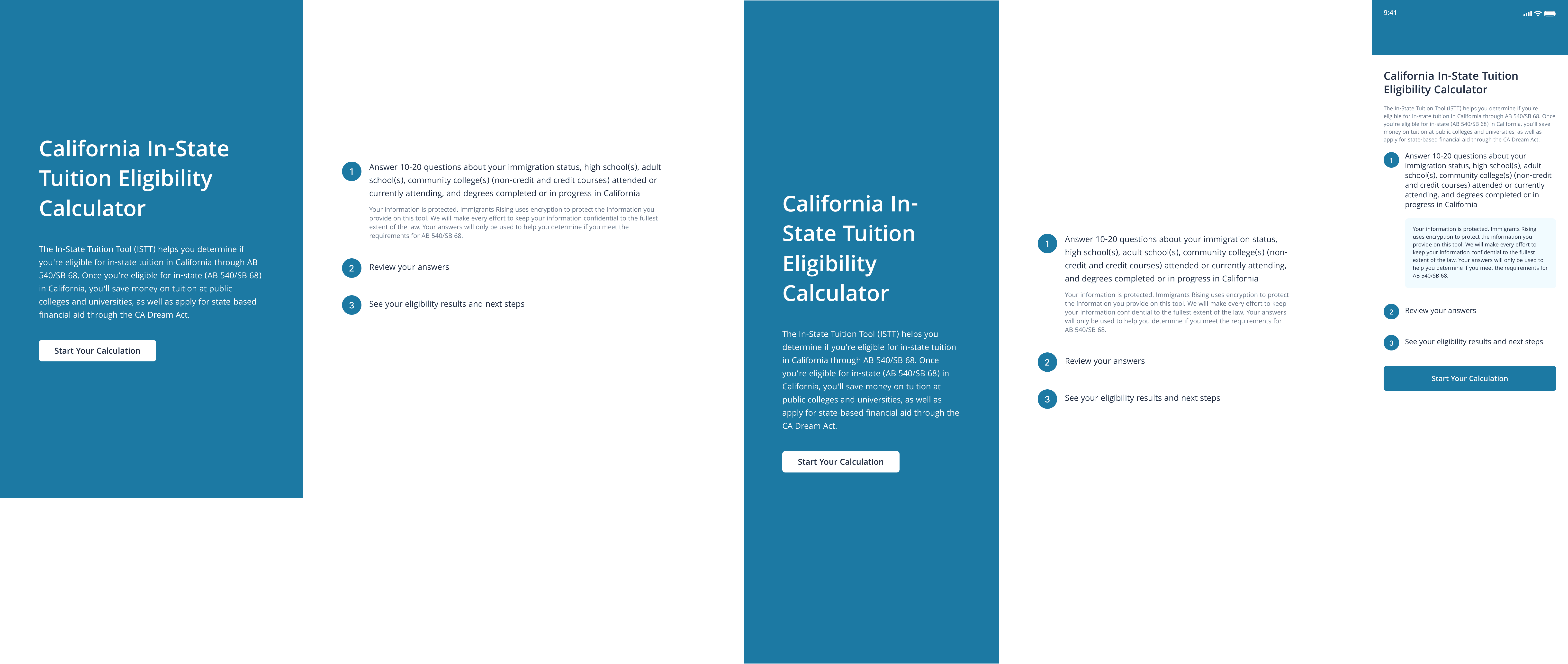
To show users progress through the multi-section form, we added a stepper but debated between a horizontal and vertical steppers. Horizontal steppers work well for long-forms with lots of scrolling and vertical for forms with lots of space on the sides of the screen, optimizing space. Vertical also aligns with users' natural reading so we ultimately decided on a vertical stepper.
Horizontal Stepper
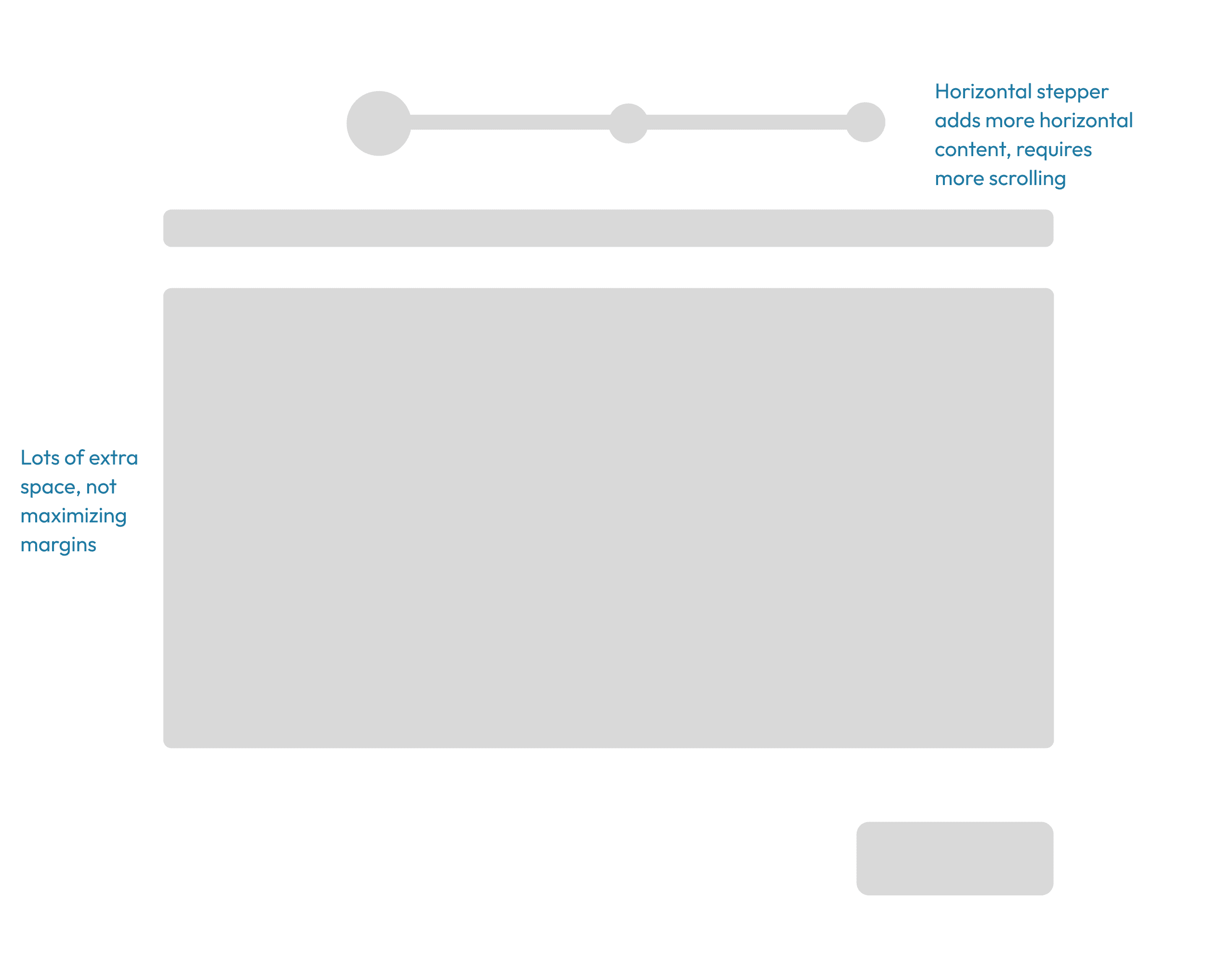
Vertical Stepper

⚖️ Long-form vs multi-section form
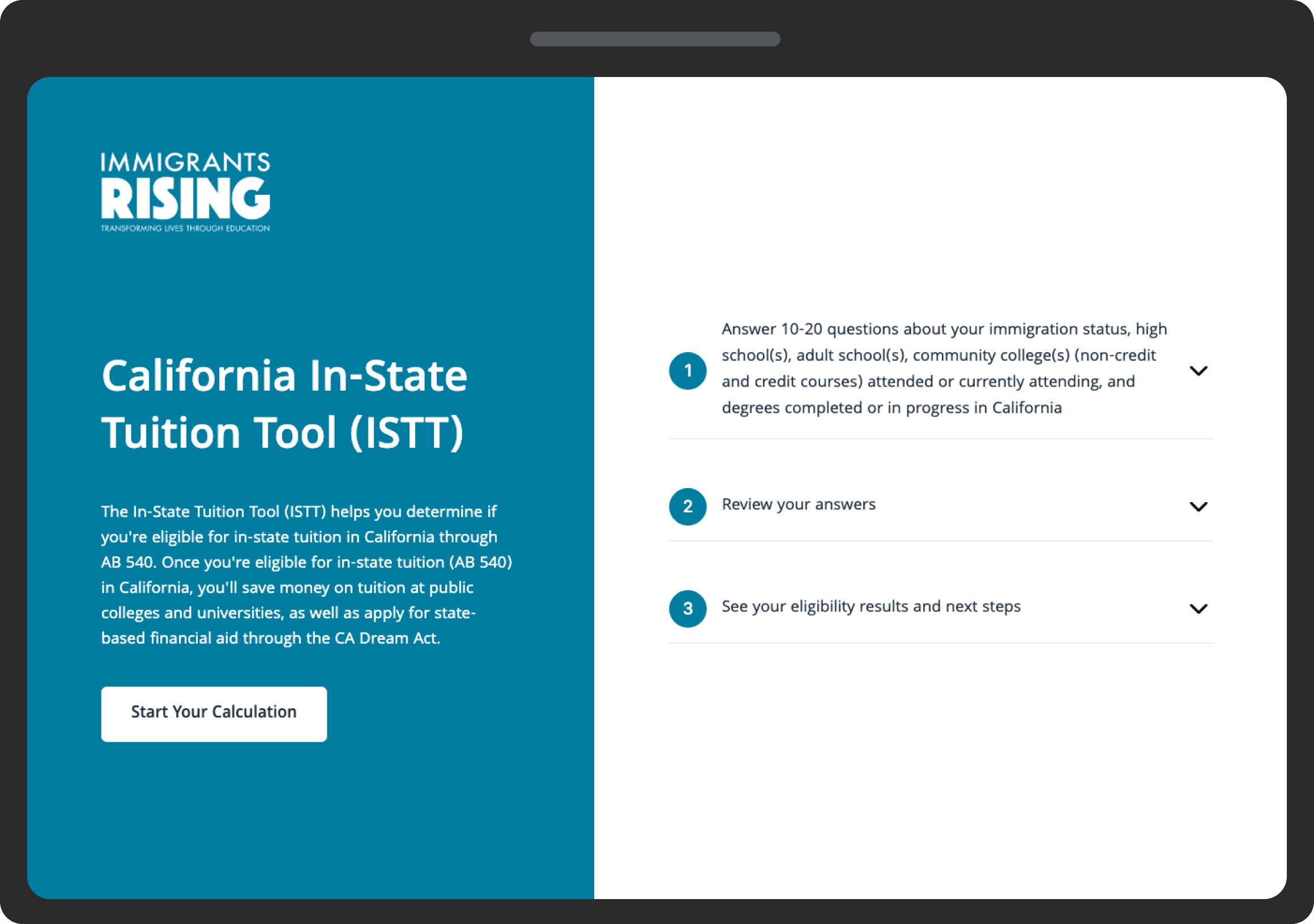
Originally, the ISTT was one long form. To simplify it, we introduced a multi-section form, breaking it into shorter sections to complete one at a time. These sections are part of a logical progression, creating a less complex and more intuitive user experience.
Long-form
Multi-selection form
Designing and validating wireframes along the way
Mid-fi wireframes
After finalizing the form flow and design, we designed mid-fi wireframes and tested them with 3 users.

Usability tests
We recruited 3 students who previously used the ISTT to conduct usability tests on our mid-fi mockups before moving on to hi-fi (more on this later!)

Hi-fi wireframes
After lots of iterations with our research insights, we designed the hi-fi wireframes.

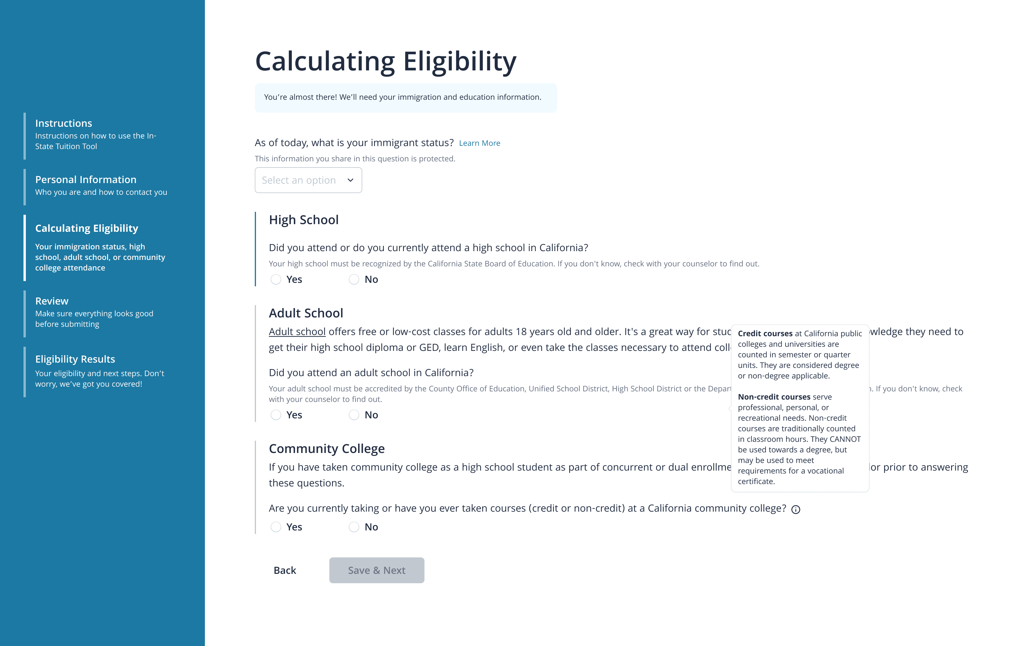
Users need more guidance in completing the form
Tooltips and learn more
To improve accuracy and completeness, we added tooltips and “Learn More” links to provide additional clarity and context. Instead of redirecting users to a separate page—which can break the information scent—we integrated the links to open pop-ups on the same page. Both tooltips and “Learn More” links are user-triggered, giving users control over when they access extra information.
Review and edit
We also added a review page so users can review and edit their information without navigating back and forth through the form. This aims to reduce errors.
Initial design
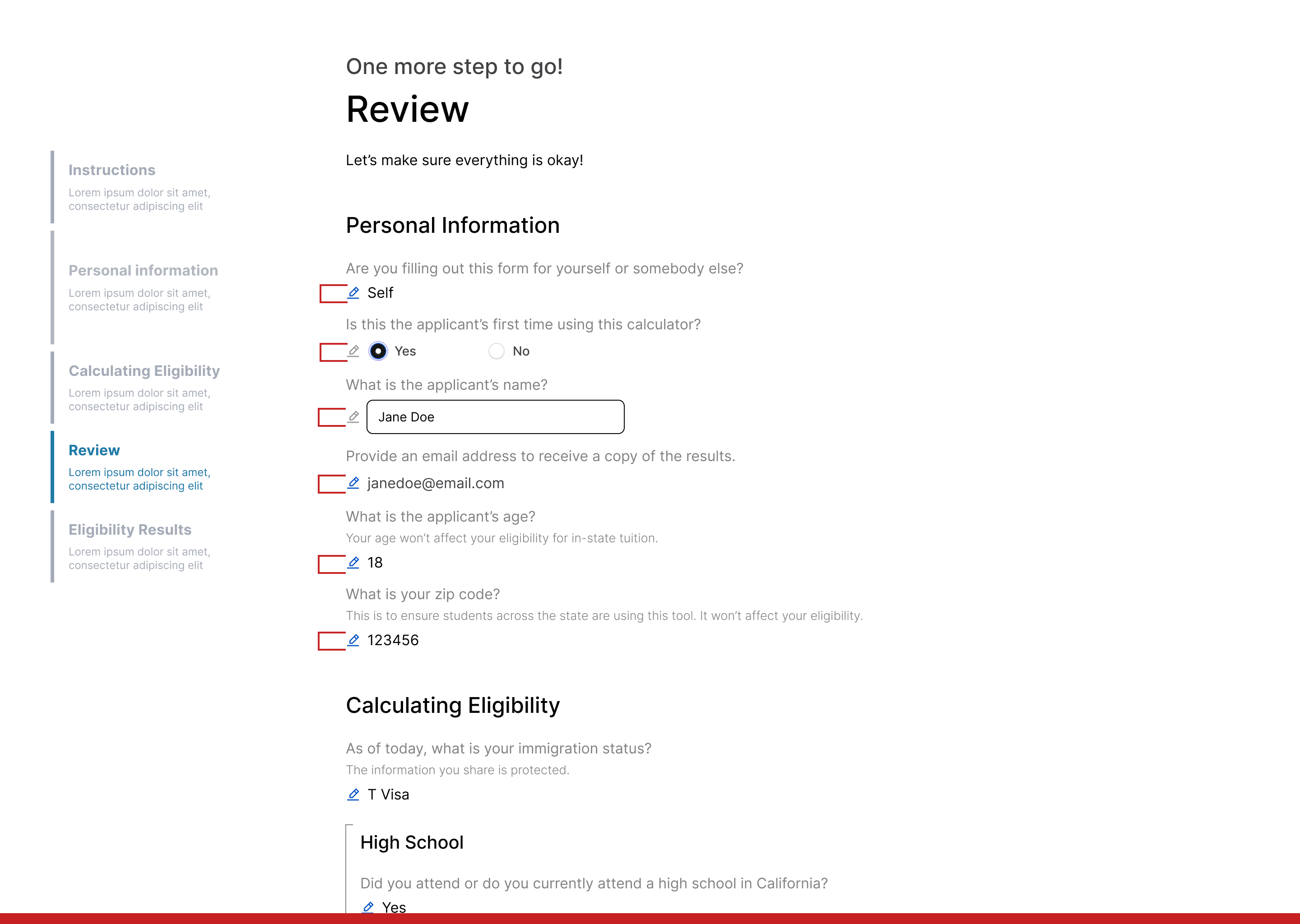
❌
Several edit buttons, overwhelming users
Final design
✅
Reduced edit buttons, added action oriented text labels
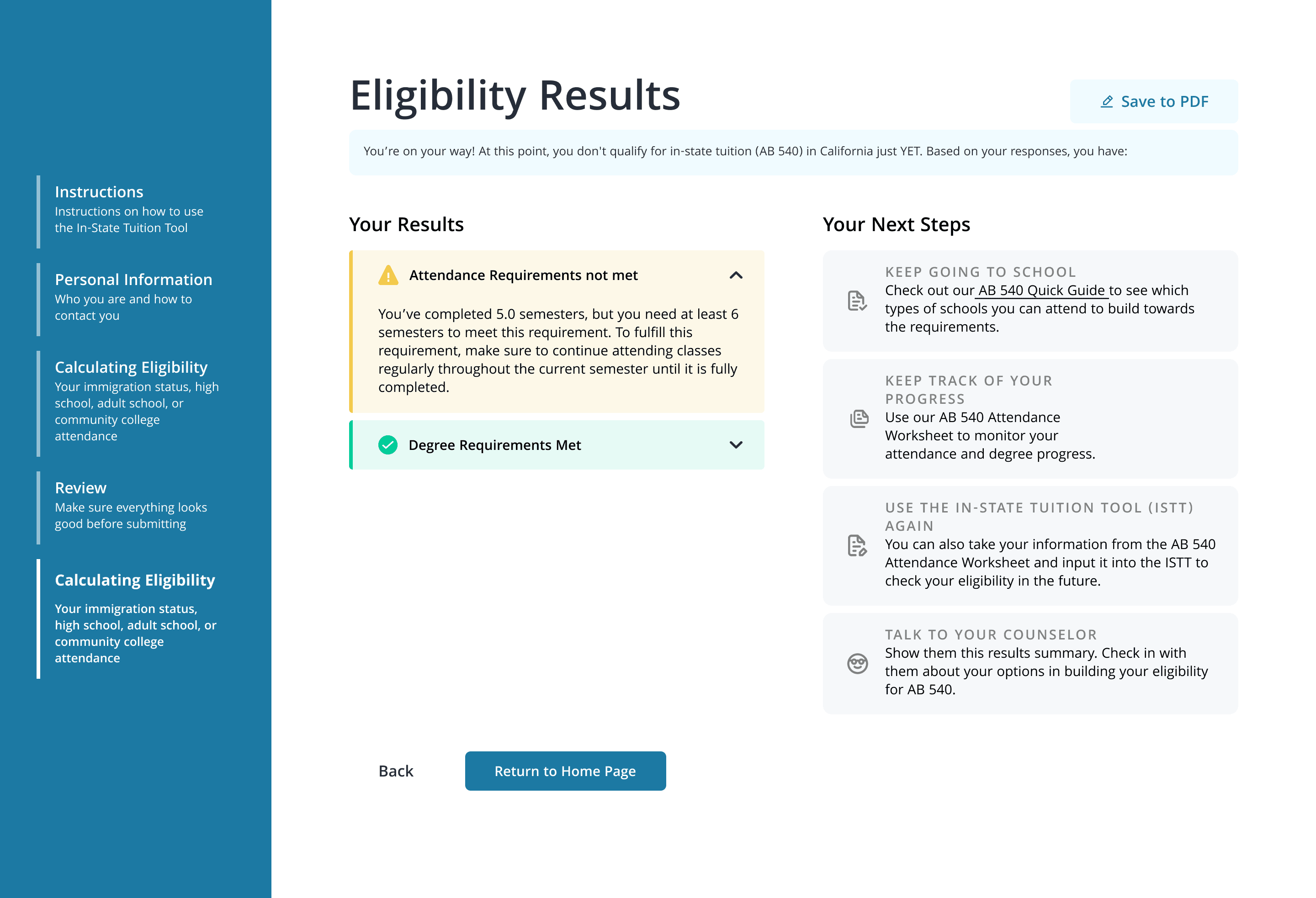
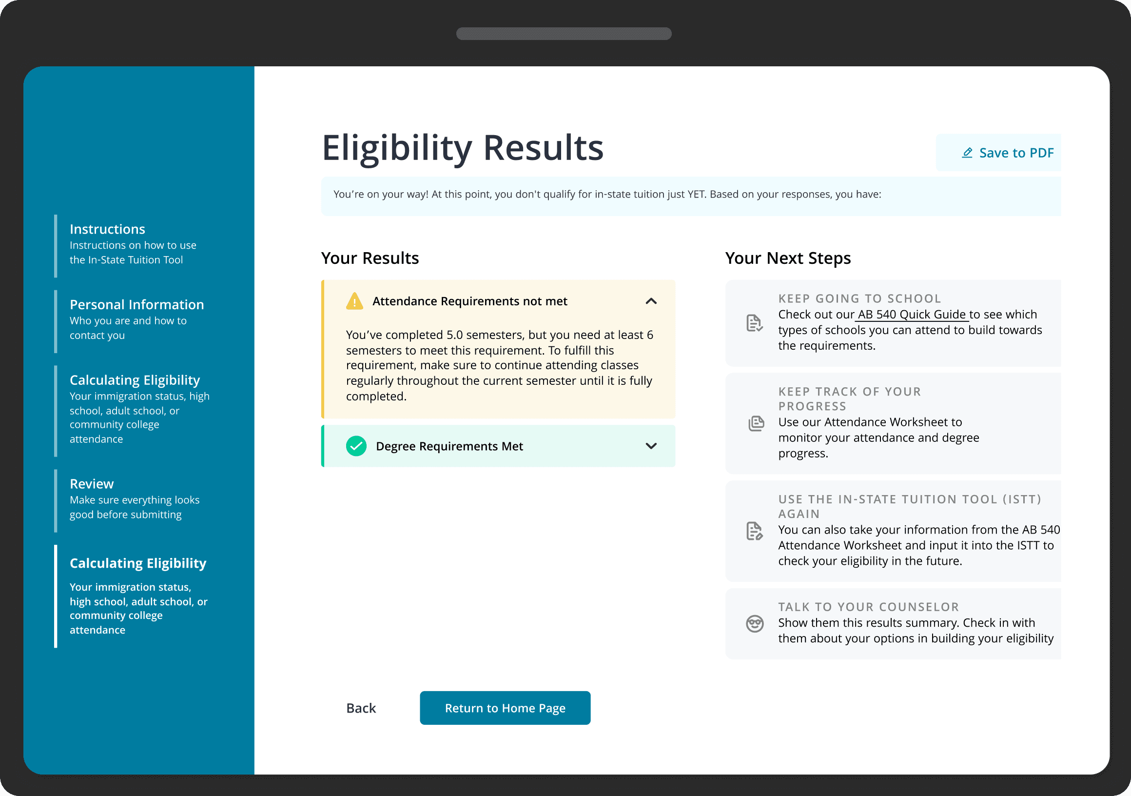
Users need clearer, more actionable results to understand their next steps
Breakdown of eligibility results and next steps
The ISTT calculates eligibility and explains why the student qualifies or not. In addition, the tool offers next steps for students who do not qualify. This significantly improves the user experience as many students struggle to understand how to qualify, necessitating a step-by-step guide integrated into the tool.
Initial design
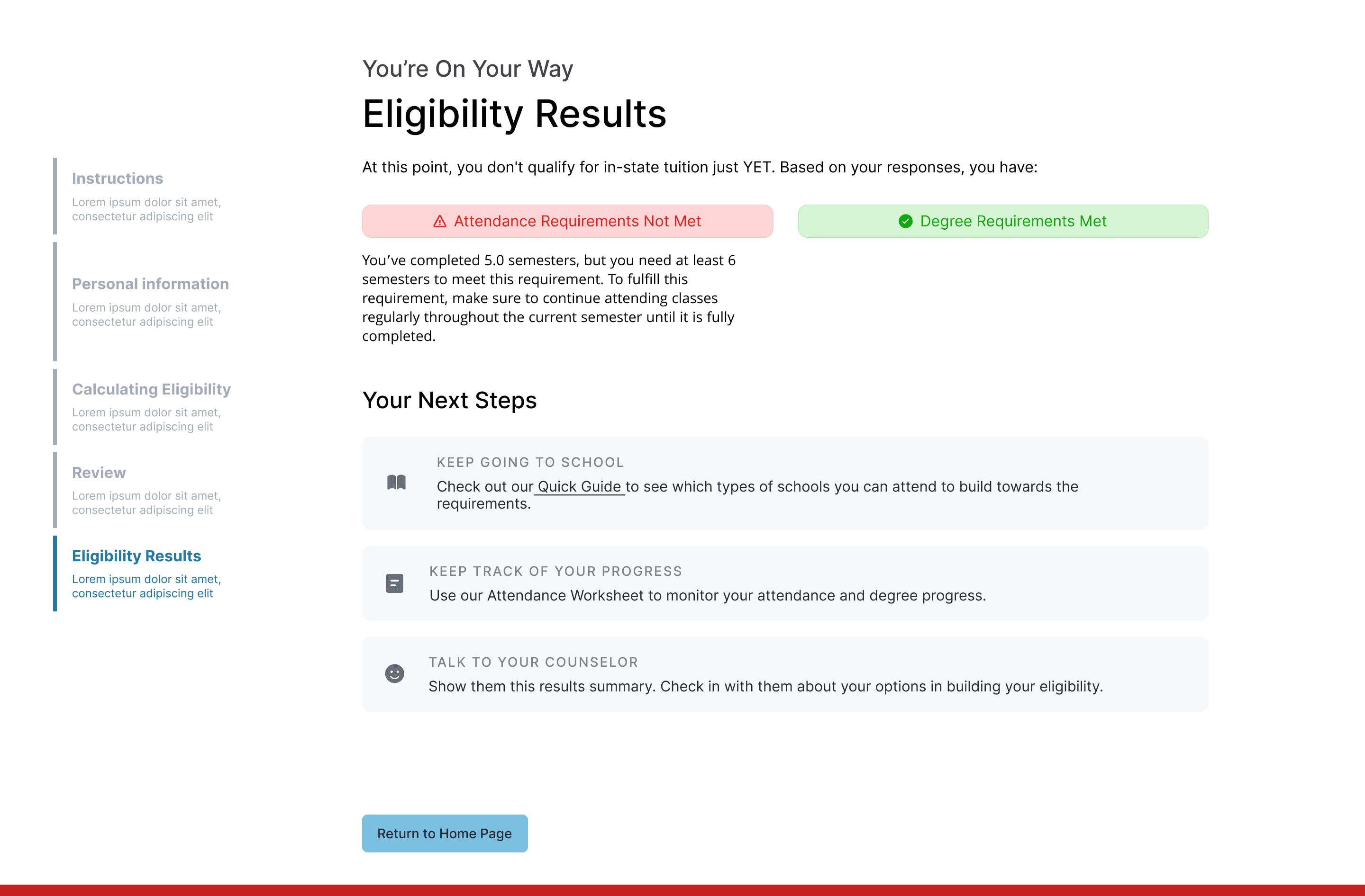
❌
Low contrast colour for the requirements not met and met
❌
Colour red = negative user experience
Final design
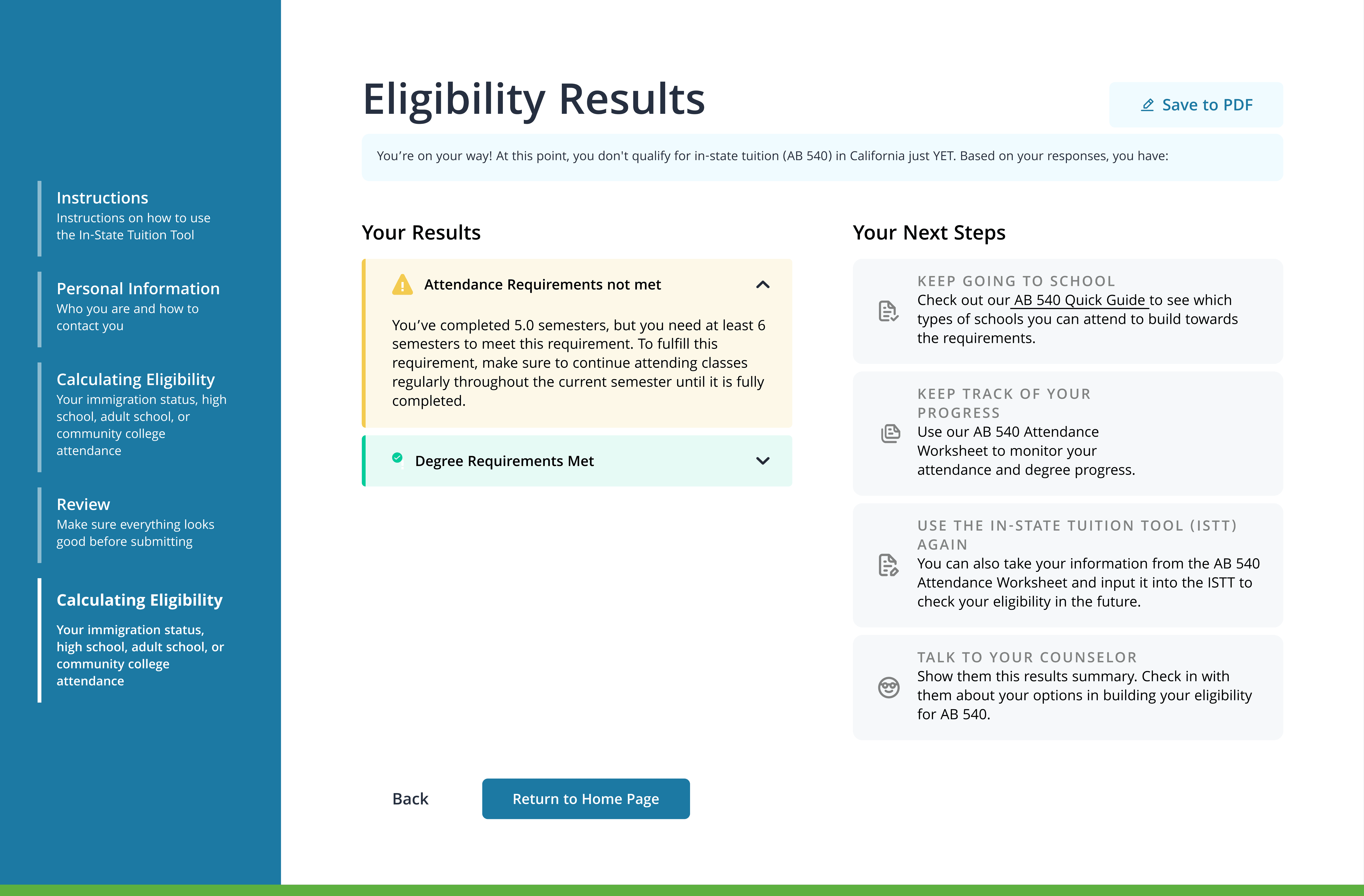
✅
Higher contrast colour
✅
Change colour red to yellow
✅
Save to PDF feature
The non-profit wanted to extend the design to both mobile and tablet devices. This meant my team needed a robust design system that would enable use to scale to different screen sizes.
Design System
We built a design system to ensure consistency and scalability across different devices. We leveraged the non-profit's existing brand guidelines to ensure seamless integration with their technology stack.

Breakpoints
Breakpoints ensure a seamless user experience across different devices by adapting the layout, content, and interactions to various screen sizes.
FINAL SOLUTION
What did I learn and take away?
Demo Day @ Develop for Good
I'm so thankful for my fellow team members and mentors at Develop for Good! This was such a meaningful experience to learn and grow, especially as an early-stage designer.
⚙️
Creative vision, practical execution
I learned how to balance innovative design thinking with real-world implementation. Working within technical constraints challenged me to design solutions that were not on user-friendly but also technically feasible.
🚧
Cross-functional collaboration is key!
I learned to communicate design decisions clearly, incorporate feedback effectively, and align the team around a shared vision. These skills helped ensure our final product was technically sound, met organizational goals, and delighted users.